

A recently discovered interest of mine is packaging design. I'm the person that goes into Selfridges and drools over the artisan sections where matte packaging finds its resting place. Or rummaging for snacks in Tesco only to notice the new tea packaging or the rebranding of Tesco's value line.
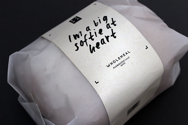
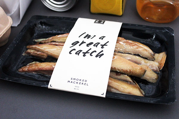
So, when I stumbled upon this project I just had to share! Designed by recent graduate Beth Fox-Fuller, it goes to show that less does mean more...much more!
Focusing on the heart of the brand and the relationship it wants to have with it's customers, this complete redesign is highly successful in meeting that need. The matte card and glassine bags are complimentary to the use of white space and the choice of typography works well in reinforcing a personable brand voice.
If my local Asda had packaging like this I know where I'd be buying!


